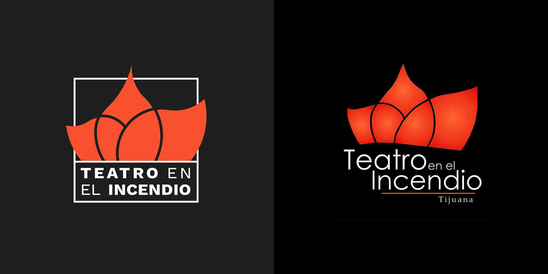
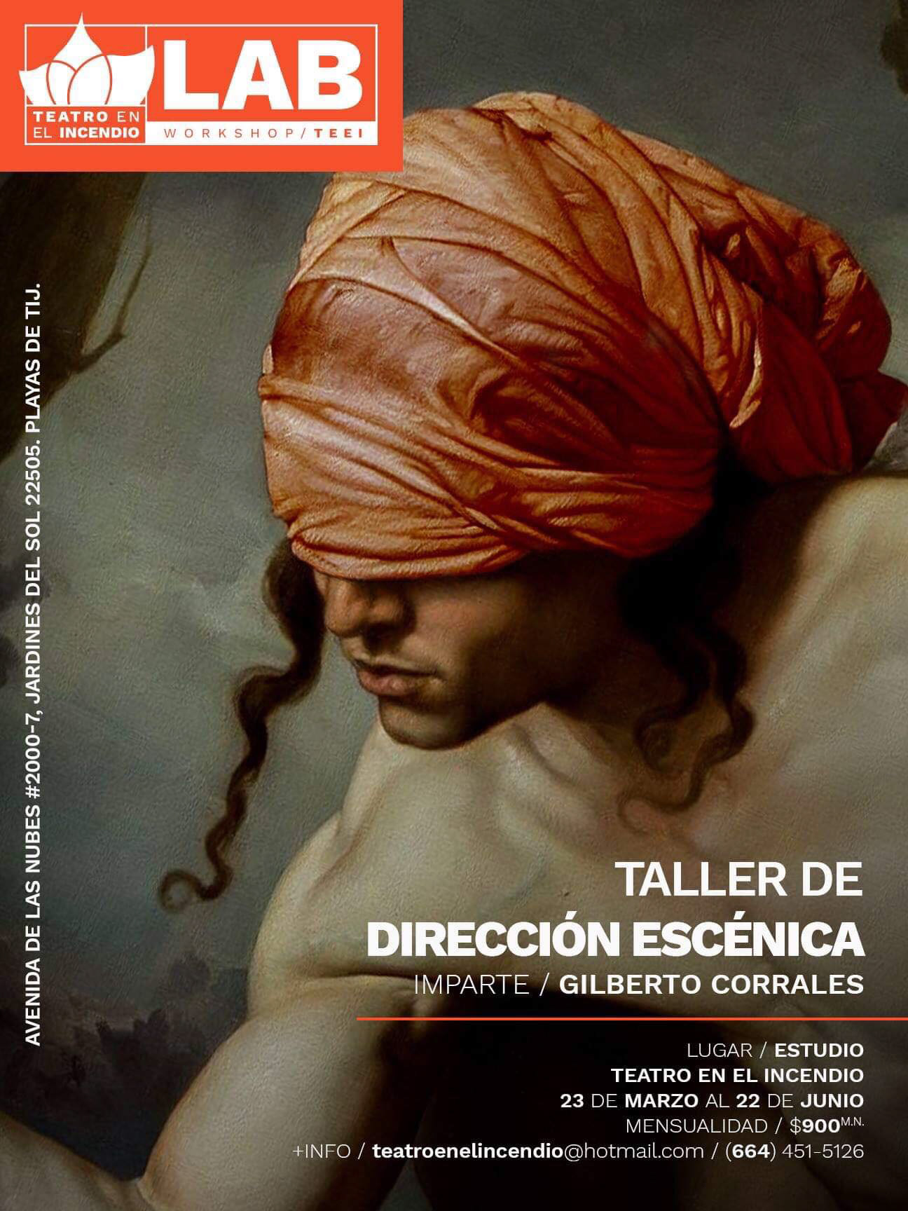
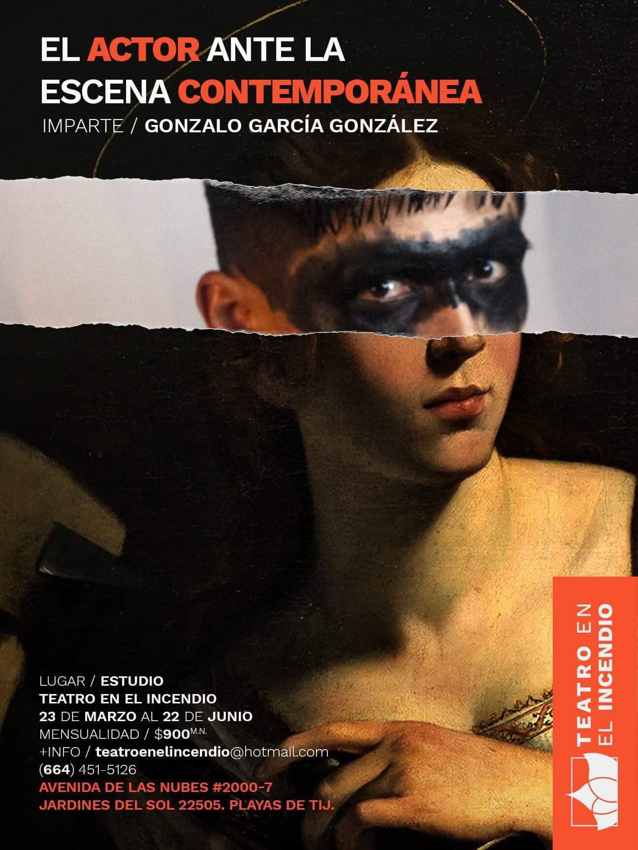
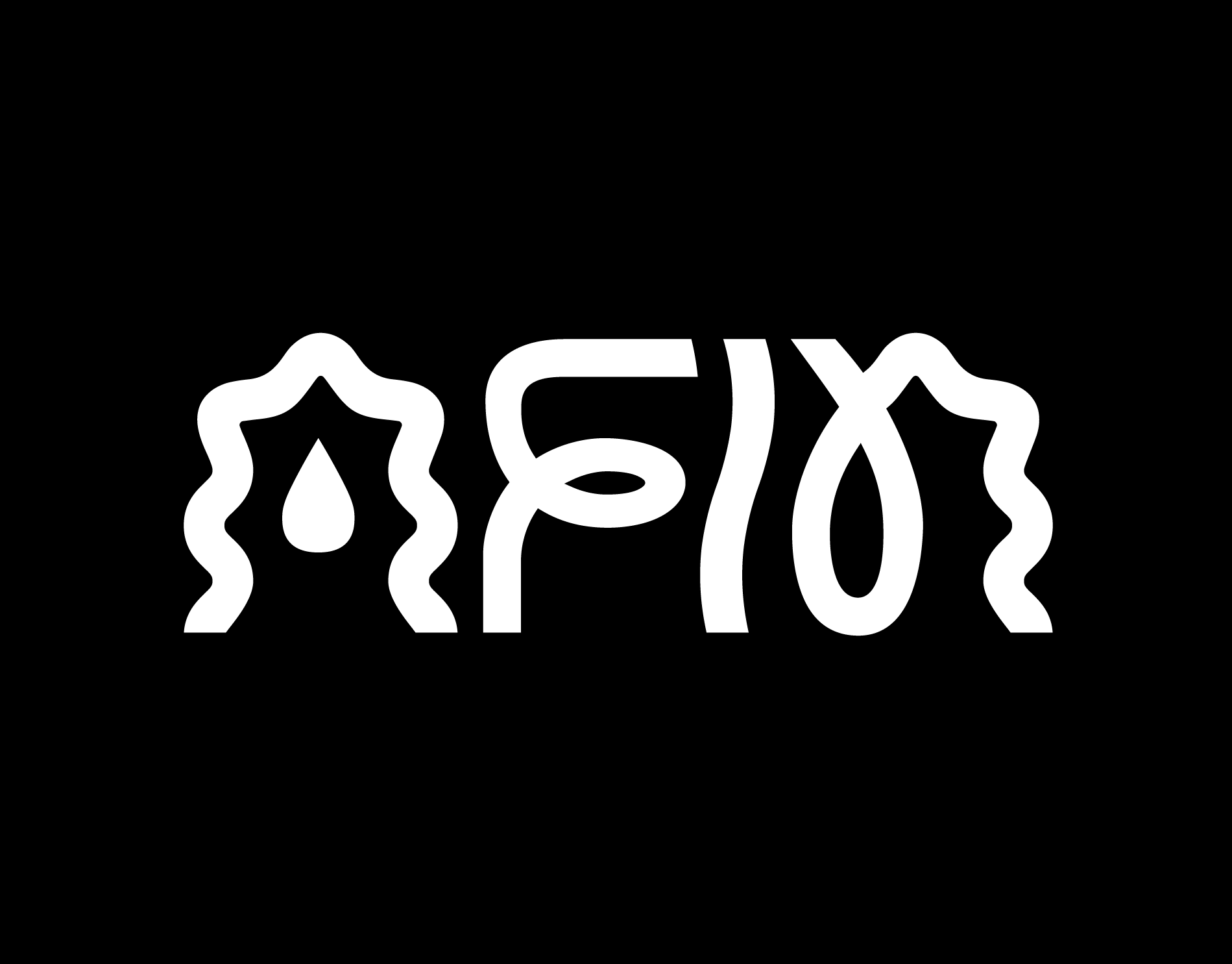
Teatro en el Incendio is a young theatre company in the city of Tijuana. They already had a well positioned logotype, so we decided to work around it and turn it into a more minimal, cleaner version of it.
The shapes were made using the Golden Ratio. I wanted to keep the abstract flame shape, considering that art itself is abstract. For the color, I took out the gradient from the isotype to use a flat orange. For the typography, I opted for a bolder font in caps, to give the logo a more mature feel. Also, the word "Tijuana" was removed, attending the company's expansion to different parts of the world.
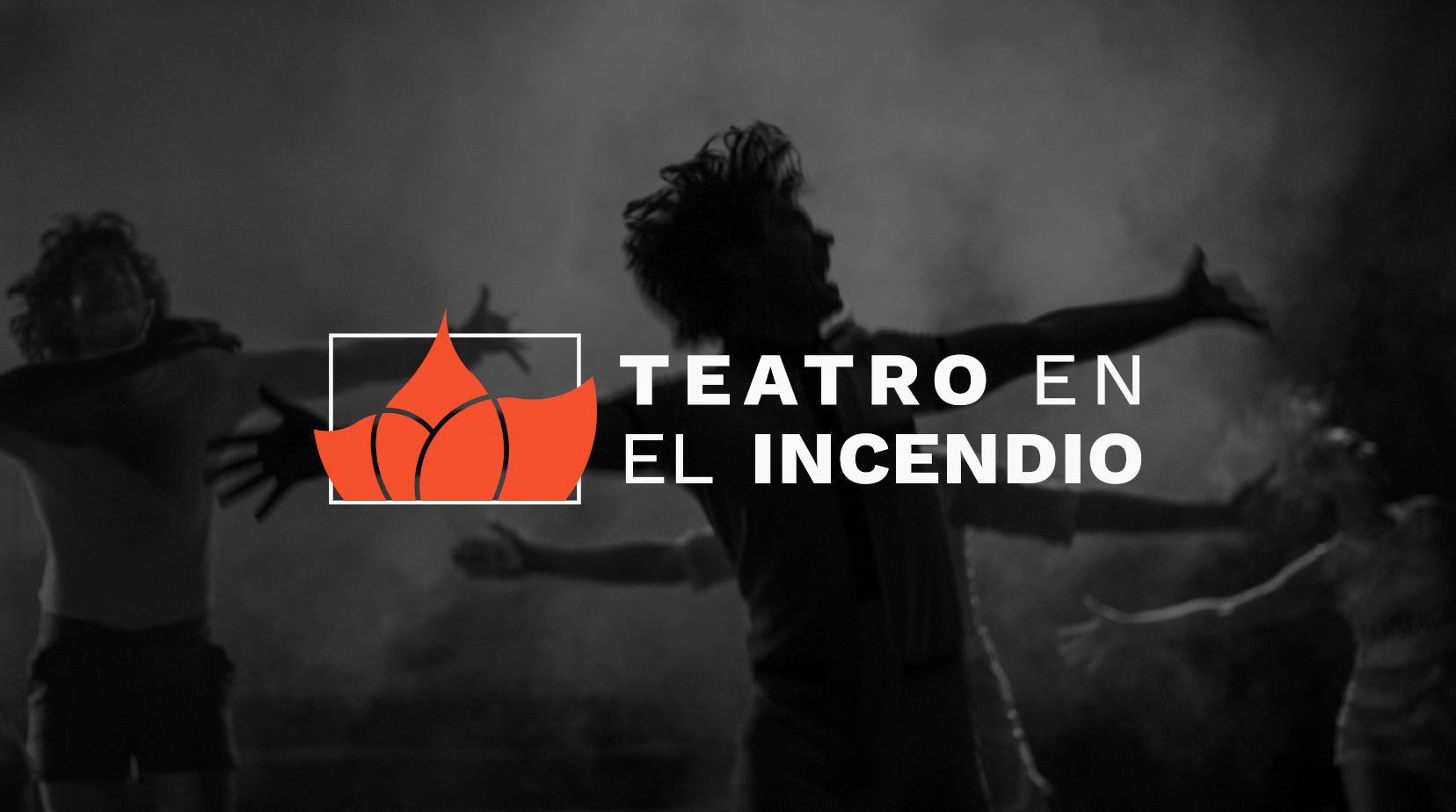
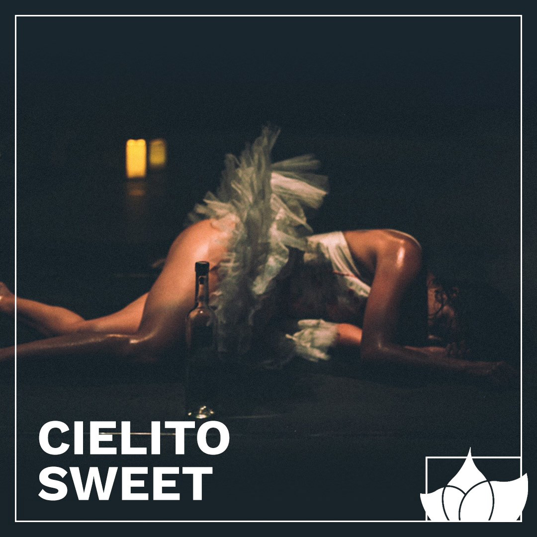
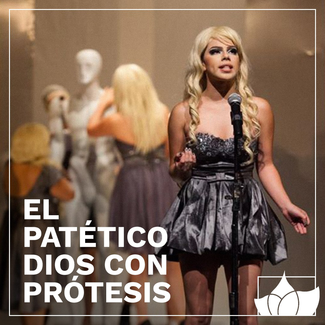
The minimal style works throughout the whole branding identity, to make space for photography or digital art to tell the main story.